COMPANY
BUSINESS
PRODUCTS
PRCENTER
SUPPORT
COMPANY
Endless Challenge for Technological Innovation for the Prosperity of Humanity
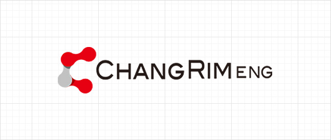
CI
The constant challenge to a sustainable industry
STANDARD FORM
The English C shape represents creativity, cost effectiveness and continuity, and emphasizes images of passion and challenge to
design images of innovation, functionality, and reliability with a modern touch.
Red color represents youth and spirit.
BASIC WORDMARK
CI stands for Corporate Identity and is used to unify the corporate image. This means establishing visual elements.
Color System
Wordmark is a visual element made up of font, and the most important representative colors are Pantone 185C and Pantone 287C.
For special media or environments, auxiliary colors can be used by selecting the colors that best match that medium and environment.
MAIN COLOR
-
PANTONE 185C
C7.31M99.8Y83.28K0R220G9B43 -
PANTONE 287C
C100M89.94Y37.55K0.3R16G45B110
SUB COLOR
-
PANTONE 542C
C60M40Y20R110G137B170 -
PANTONE Cool Gray 10C
K70R110G110B110 -
PANTONE Cool Gray 10C
K50R149G149B149
Head office 12, SeongSeo-ro 71gil, Dalseo-gu, Daegu, 42703 South Korea
TEL 82-53-591-4272
FAX 82-53-591-4275
ⓒ2023 ChangRim ENG Inc. All Rights Reserved.